
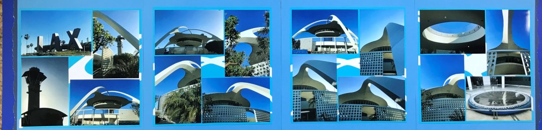
2018: LAX Theme Building

After my adventures in California, I headed up to Washington for the next phase of my June 2018 trip. As I had an early morning flight I decided to stay at a hotel near LAX so that I didn’t have to worry about early morning waking up and traffic. After I checked in at the airport hotel I walked down to the LAX Theme Building (Read the Wikipedia entry for history of this amazing building). The sky was blue and beautiful and I ended up taking over 50 pictures of this location which walking around it. When I was there it was mostly abandoned, but it has formally been a night club and a restaurant.
Since I had taken so many pictures I decided to do a 4-page spread with an opening cover using panoramic fold-out plastic page protectors. The picture above is the 2 page opening spread. I used Fiverr.com to find someone who could create the SVG cut out of the LAX Theme Building for me, and then used my Cricut Machine to cut out the images. I used a black marker to put a black border on all of the pieces to help them stand out against the light blue background. I used a jagged edge tearing tool to create the rough borders on the right and left hand side of this spread. One of the things that I really enjoy about this spread is the dark blue border strip with the two holes in it on the left hand side. This is actually left over from circle cuts that I made for the Richard Nixon Spread for embellishments in the middle of the pictures. It was fun to use that on this page as the look fits in with the modern theme of the building.
When you open up the spread from the middle, it opens up to show you this 4-page spread:

I am going to suggest that you click on the image to get it in full size so that you have opportunity to look at the pictures a little closer. I carried the color theme from the opening spread to this spread, which highlights the beautiful blue sky in the pictures. I created a 4-photo border for each of the pages and used the exact same layout on all the pages to create modern uniformity on this spread while showcasing a building that has hardly any straight lines. On each border I also cut out different parts of the building SVG in white and put it behind the photos. While this does not stand out very much, it helps to fill the empty space in the middle of each photo set, and creates interest for the viewer who is paying more careful attention.
Categories: 2018
