
2021: Oklahoma City Museum of Art
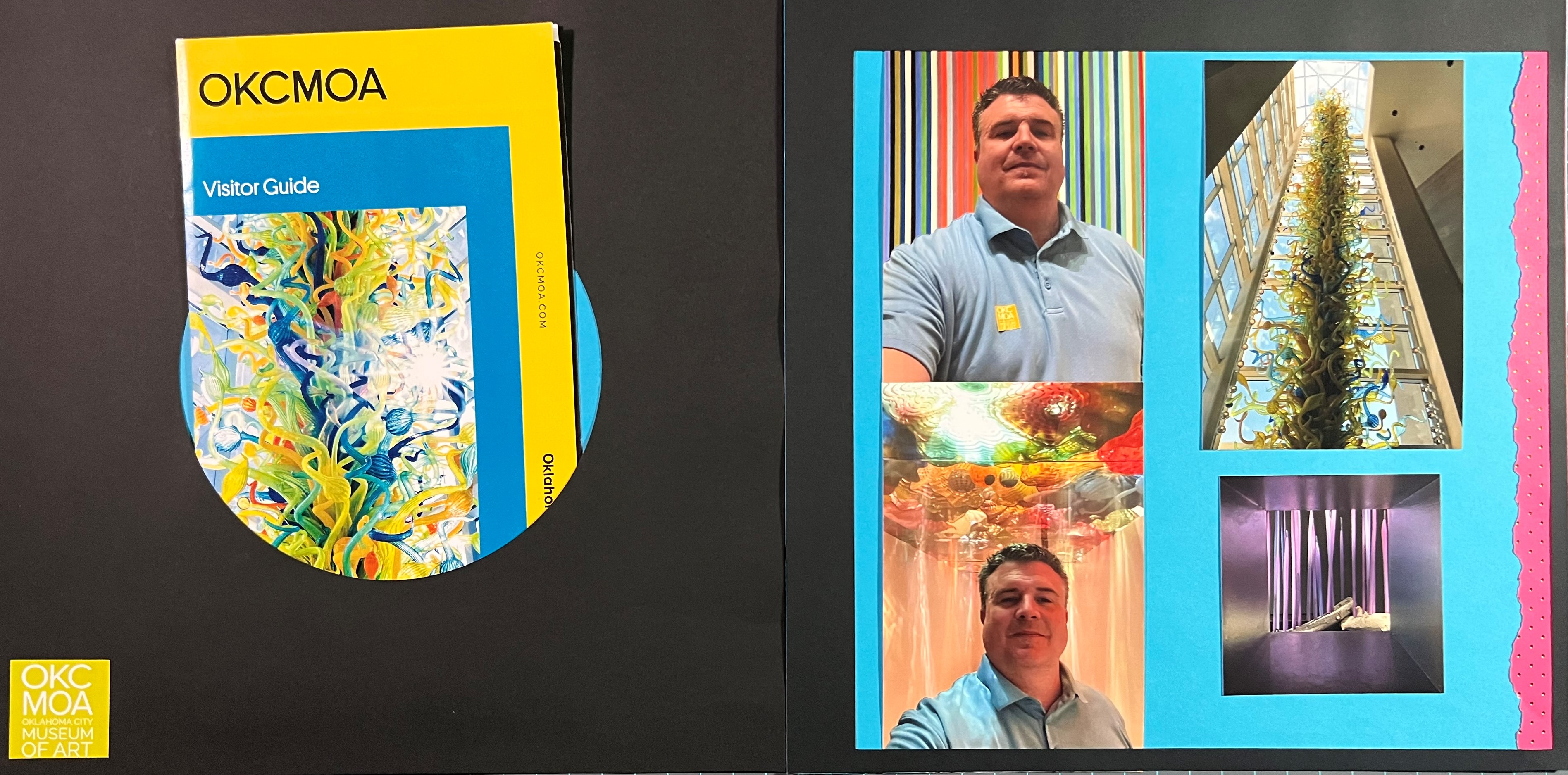
I had the opportunity to travel with our President’s Leadership Class to Oklahoma City for a weekend together, and one of our first activities was to visit the Oklahoma City Museum of Art (OKCMOA). One of my favorite artists, Dale Chihuly, has a large installation at the museum, and a signature piece can be seen in the top right-hand corner – a towering collection of hand-blown glass. I encourage you to visit each of these websites to learn more about them.
I chose an interesting design for this spread – fairly muted on the left-hand page, and some shocking colors on the right. I did this for a couple of reasons. First, I wanted to create a unique way of showcasing the brochure on the page, but I also wanted to highlight the amount of color in the exhibits that were my favorites. The museum brochure and the pictures I took are all bright and busy, and to help them stand out I chose solid background colors.
For the left-hand page I used my Cricut machine to cut out the center circle to create a pocket that the museum visitor guide can sit in but can be pulled out to be viewed. By placing it on a black background page it signals to the viewer that they should take it out to look at it. (To see how I created the pocket, view the video below.)
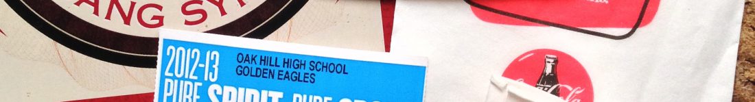
In the bottom left-hand corner is the admissions sticker that we had to wear in the museum. You can see it on my shirt in one of the photos on the right-hand page. When I have stickers like this that you have to wear at an event or location, I always keep the plastic-coated backing that it came on so that I can put it back onto it when the event is over. This makes it easy to store and then put on the page using its own adhesive.
On the right-hand page, I used a black leftover cutout from an earlier project to create a border for the entire page, which helps to tie it to the left-hand page. I overlapped the photos and the pink border on that page to create a frame effect which is appropriate for an art museum and mimics the picture in the bottom right-hand corner which was taken through a square hole in a wall of the museum.
This spread is another example of muting the design elements so that focus is instead put on the details of the photos and brochures.
Recently for most of my scrapbook creations I have also created videos that show me putting them together and talking about the experiences as well as the techniques that I am using. So please enjoy watching this spread being created and assembled:
Categories: 2021, Art Museums, Museums
