
2013: Zest and Triple D

2013:Zest and Triple D
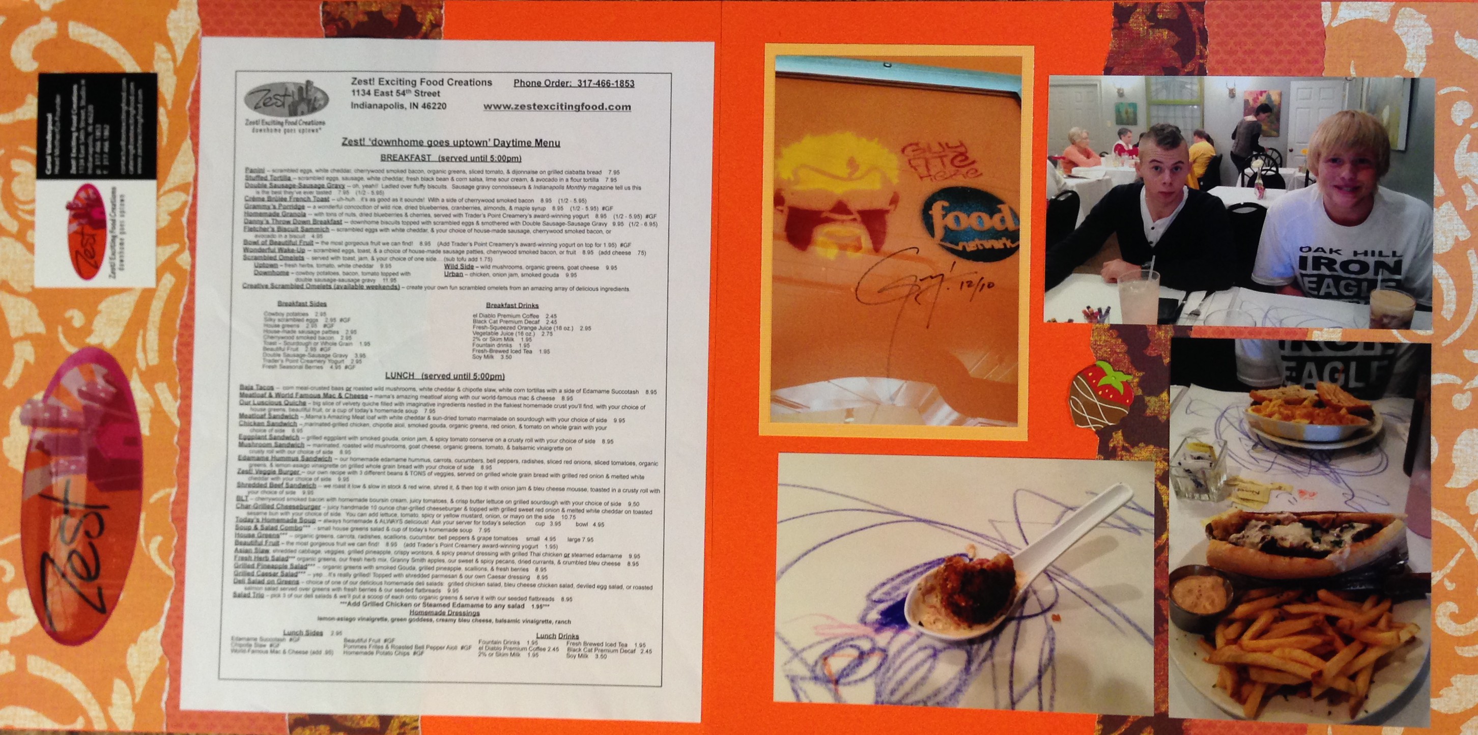
 One of our family traditions is to try and visit as many Triple D locations as possible. Triple D is a Food Network Show in which Guy Fieri showcases fun restaurants from around the country. There is a list of all the ones he has reviewed at FlavortownUSA.com and we have been to quite a few of them.
This spread showcases our meal at Zest in Indianapolis, IN. I tried all of the menu items that Guy reviewed on the show, and I must admit that they tasted great!
The color scheme for this page was taken from the logo of the restaurant which is orange, purple and pink. I used a solid orange background page and then used torn scraps from other projects to add energy and life to the page.
The right hand page contains the menu, a business card, and a carefully hand-cut photograph of the logo in the window of the restaurant.
The left hand side contains pictures of the boys, our appetizer, my yummy meal, and the Guy Fieri “tag” that he leaves in every restaurant that he reviews. For the “Tag” photo, the orange color of the wall in the picture did blend well with the background page, so I used a different orange colored border to create a space between the two oranges which helped for the colors to work better together.
2013: Triple D and Zest 2
The picture to the left is of the exact same pages but placed in the opposite order. There are many times when I make pages like this that can be placed in either order.
I usually create an album full of pages before I actually insert them into the album all at once. This way i can balance pages out across albums and I also have more time to decide how I want to place the pages like this one.
Categories: 2013, Restaurants
