
Europe Vacation: Notre Dame
Europe Vacation: Notre Dame
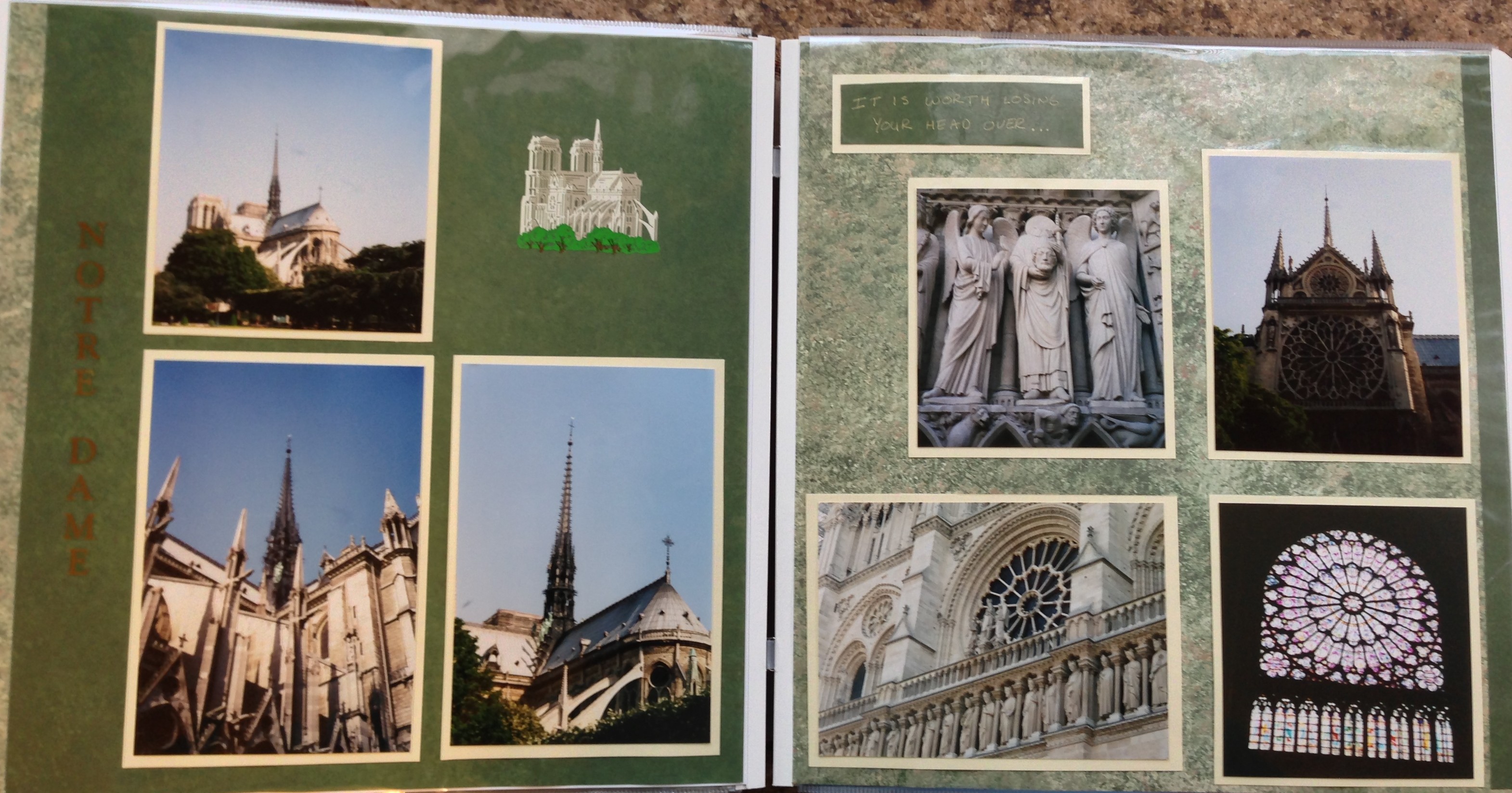
While I like the look of this Notre Dame page, I have learned some things that I would now do differently. I will self critique my work to give examples of how this design could be improved.
First, I no longer use letter stickers on my pages. I have found that they are often not the correct size, as is the case on this page, and you end up with lots of letters that you cannot ever use. I currently use my Cricut machine to cut out letters if I wish to Title a page like this.
Second, when I created this page I also had an affinity to stickers and I often felt obligated to use them on pages. I think that this sticker is too small to be on this page, and seems to diminish the pictures rather than complement them. I also would now not place the sticker in the middle of the open space, but would probably move it to the lower left corner of the space to de-emphasize the sticker over the value of the photographs.
Something that I still like though is the funny picture of the statue of the Saint holding his own head and the comment I journaled above it. I still like to find quirky things on our adventures and make sure that they make it into our scrapbooks. Currently though I enjoy hiding them in the pages, rather than pointing them out like I did in this instance.

Categories: Europe Vacation 2002
