
Choosing Scrapbook Color Schemes with ChatGPT
AI in the Scrapbook Room: Article 7
One of the first decisions I make when starting a new scrapbook spread is choosing the colors. Sometimes the choice is obvious because the photographs, location, or event suggest a particular combination. Other times, I find myself looking through my cardstock collection, trying to decide which colors will work together.
Color can have a tremendous influence on the appearance of a scrapbook page. It can help establish the mood, connect photographs that were taken in different settings, and create a sense of continuity across a two-page spread. But selecting colors isn’t always as straightforward as it might seem, particularly when you’re working with photographs that contain several competing colors.
This is one area where ChatGPT can be an interesting tool to experiment with. You can ask it to examine photographs, suggest coordinated palettes, or help you make better use of the cardstock you already own. You don’t need to understand all the technical aspects of color theory to begin exploring the possibilities.
For this article, I’ve identified five different ways to use ChatGPT when selecting scrapbook colors. Rather than trying to explain every technique in detail through writing, I’m creating a short video demonstration for each one. That way, you can see the actual prompts, examine the results, and follow along with your own projects.
1. Finding Colors in Your Photographs
One of the easiest ways to develop a scrapbook color scheme is to begin with the photographs themselves. A landscape photograph might contain beautiful combinations of blues, greens, and browns, while a photograph taken at a special event might feature distinctive colors in the decorations, clothing, or surroundings.
ChatGPT can examine an uploaded photograph and suggest colors that complement it. You can ask it to identify the dominant colors, recommend accent colors, and explain how those colors might work together on a scrapbook page.
Try this prompt:
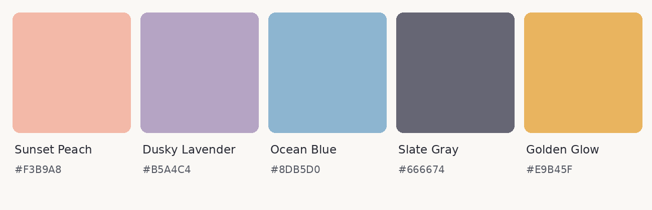
I’m uploading a photograph that I want to use in a scrapbook layout. Please examine the image and suggest a coordinated five-color palette inspired by the photograph. Identify which colors would work best for the background cardstock, photo mats, and embellishments. Please also create a visual color swatch showing the five colors.
One useful follow-up is to ask ChatGPT to create a version of the palette with more muted colors or stronger contrast. You may discover that the colors most prominent in the photograph aren’t necessarily the ones you want to emphasize in your scrapbook design.
Video Tutorial 1: Finding Colors in Your Photographs
2. Creating Coordinated Color Palettes
Sometimes I already know one color I want to use but haven’t decided what should go with it. Perhaps I’ve selected a particular cardstock background or want to incorporate a color associated with the event I’m documenting.
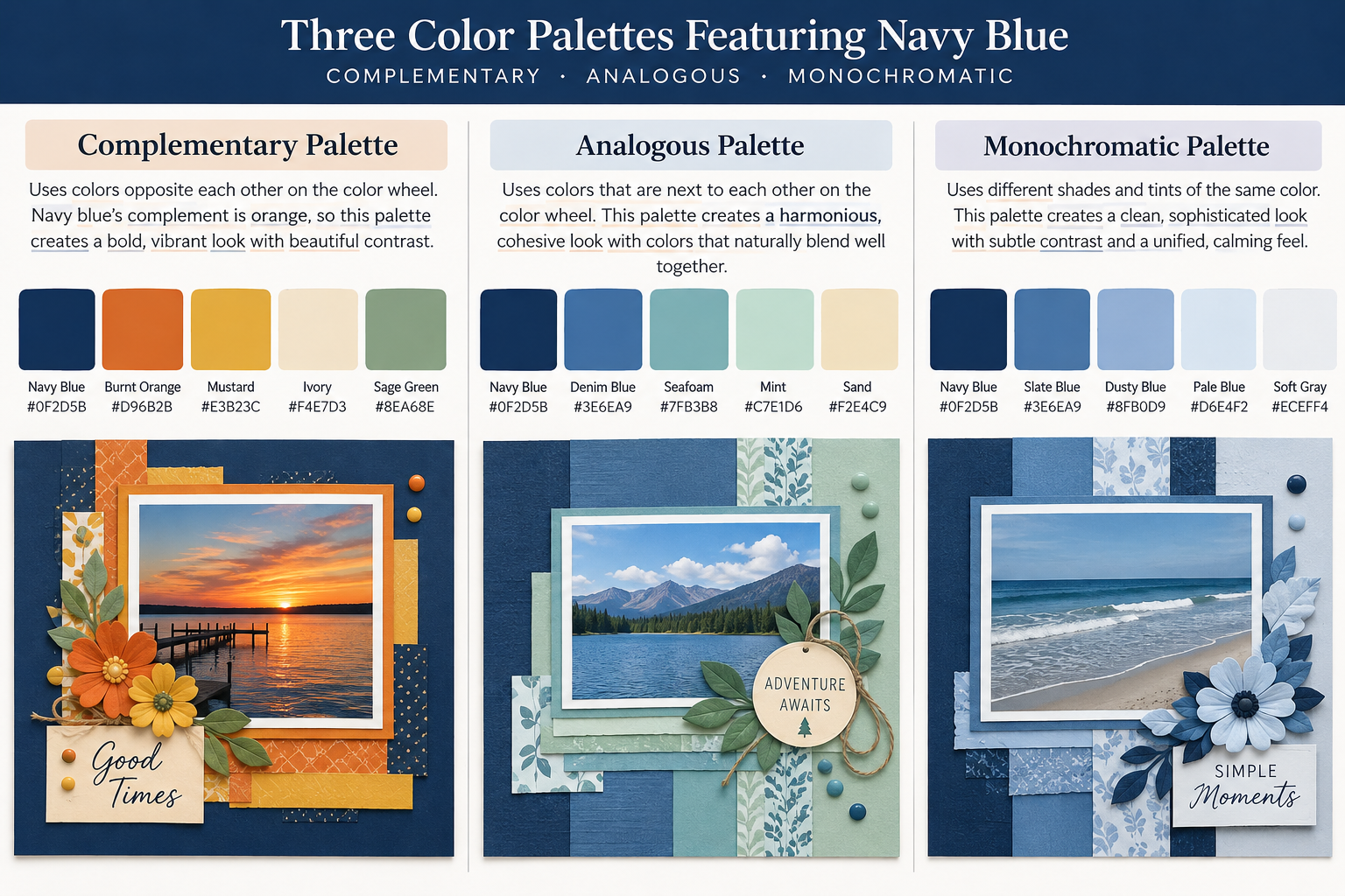
ChatGPT can help develop several coordinated palettes beginning with that single color. You can ask for complementary colors that provide contrast, analogous colors that create a harmonious appearance, or monochromatic combinations that use different shades of the same color.
The interesting part is seeing how different combinations can change the overall appearance of a scrapbook page without changing the photographs.
Try this prompt:
I’m creating a scrapbook layout and want to use navy blue as my primary color. Suggest three different five-color palettes: one complementary, one analogous, and one monochromatic. Explain the differences between them and create a visual color swatch for each palette.
You can substitute any color you prefer. If one palette appeals to you, ask ChatGPT to adjust the shades or recommend how much of each color to use. For example, you might want navy to dominate the design while using a brighter color only for small accents.
Video Tutorial 2: Creating Coordinated Color Palettes
3. Choosing Colors for a Destination or Event
Sometimes the subject of a scrapbook spread suggests a color scheme even before you look at the photographs. A beach vacation, mountain adventure, holiday celebration, or visit to a historic location may have colors that help communicate the experience.
ChatGPT can suggest palettes based on a destination or event, drawing inspiration from landscapes, architecture, cultural traditions, or other recognizable characteristics. This can be particularly useful when you’re creating several spreads from the same trip and want them to feel connected.
Try this prompt:
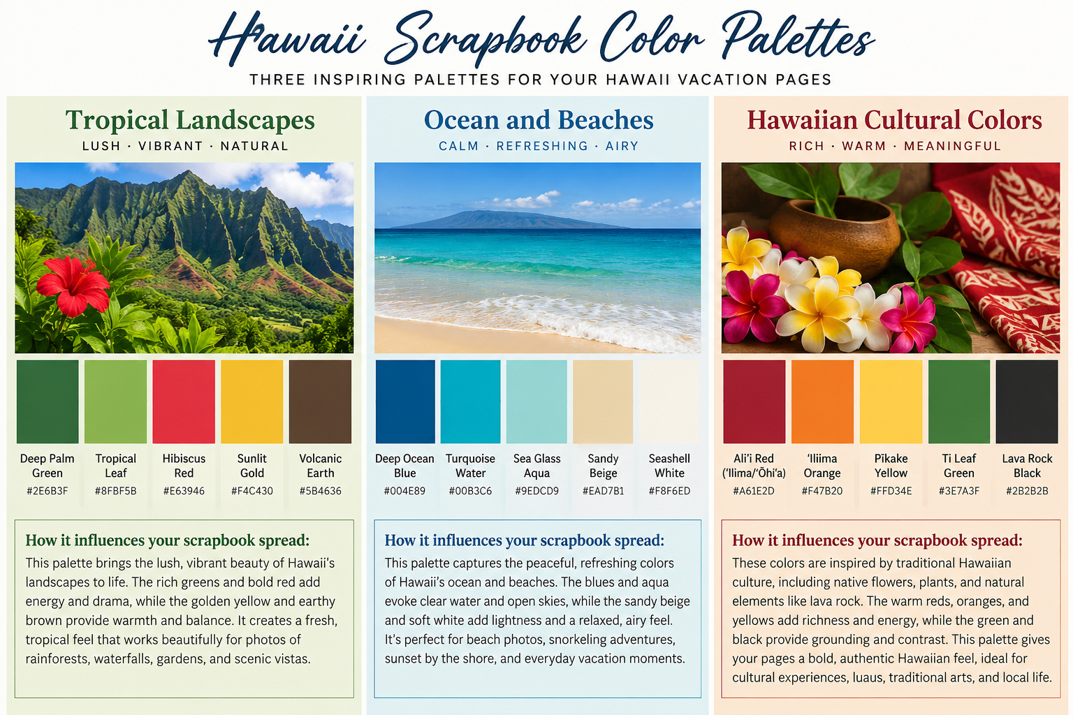
I’m creating scrapbook pages about a vacation in Hawaii. Suggest three different five-color palettes inspired by the islands. I’d like one based on tropical landscapes, one inspired by the ocean and beaches, and one that reflects traditional Hawaiian cultural colors. Create visual swatches and explain how each palette might influence the appearance of a scrapbook spread.
You can make the request more specific by naming an attraction, location, or activity. If you’re using colors associated with a particular culture or historical setting, it’s worth checking the accuracy of ChatGPT’s explanations rather than assuming every association is correct.
Video Tutorial 3: Choosing Colors for a Destination or Event
4. Working with the Cardstock You Already Own
I suspect many scrapbookers can relate to having a substantial collection of cardstock and patterned paper, yet somehow still feeling that they don’t have quite the right colors for a project!
Rather than beginning with an ideal palette and then purchasing additional supplies, you can reverse the process. Tell ChatGPT which colors you already have and ask it to develop combinations using those materials.
You can type a list of available colors or upload a photograph of several cardstock sheets arranged together. A photograph may not reproduce the colors perfectly because lighting and camera settings can affect their appearance, but it can still provide a useful starting point.
Try this prompt:
I’m uploading a photograph of cardstock colors I already own. Please suggest three coordinated color combinations using only the colors shown. For each combination, recommend a background color, a photo mat color, and one or two accent colors. Explain which combination would work best for a masculine travel scrapbook layout.
You can also tell ChatGPT which colors you have in larger quantities or which sheets you’re trying to use up. If you have a particular photograph in mind, upload that as well and ask it to recommend the best combination from your available supplies.
Video Tutorial 4: Working with the Cardstock You Already Own
5. Coordinating Colors Across a Two-Page Spread
Since I generally create two-page, 12-by-12-inch scrapbook spreads, I’m particularly interested in how colors work across both pages. I want the pages to feel connected, but they don’t necessarily need to be identical.
For example, I might use the same background cardstock on both pages but vary the accent colors. Alternatively, I could reverse the colors, using navy as the primary color on one page and as an accent on the other. The challenge is maintaining a sense of balance across the entire spread.
ChatGPT can suggest different ways to distribute colors between two pages, especially if you provide information about the photographs and overall arrangement.
Try this prompt:
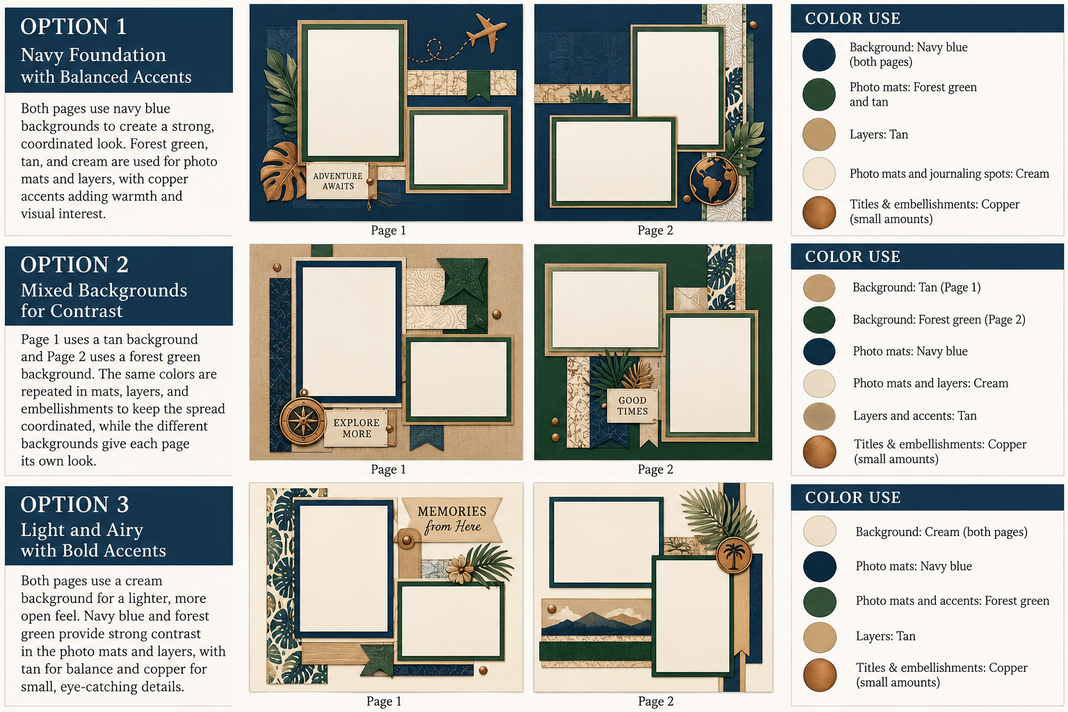
I’m designing a two-page, 12-by-12-inch scrapbook spread using navy blue, forest green, tan, cream, and a small amount of copper. Suggest three different ways to distribute these colors across the two pages so they feel coordinated without looking identical. Explain which colors should be used for backgrounds, photo mats, titles, and embellishments. Please create a simple visual concept for each option.
You can then refine the suggestions based on your actual layout. If one page has more photographs than the other, or if you plan to include a large title or piece of memorabilia, explain that to ChatGPT and ask it to adjust the color distribution.
Video Tutorial 5: Coordinating Colors Across a Two-Page Spread
A Few Things to Keep in Mind
As you experiment with these techniques, remember that the colors you see on a computer screen may not exactly match the cardstock you have in your scrapbook room. Screen settings, lighting, printers, and the characteristics of different papers can all affect how colors appear.
ChatGPT can suggest color combinations and create visual examples, but you’ll still want to compare those suggestions with your actual materials before committing to a design. I also wouldn’t rely on an AI-generated image for precise color matching. If you need an exact color, such as one associated with a particular brand or organization, verify it using an appropriate reference.
Another thing I’ve learned is that the first suggestion isn’t necessarily the one you’ll want to use. If a palette seems too bright, too muted, or simply doesn’t feel right for your photographs, tell ChatGPT what you want to change. You can ask it to replace a color, increase the contrast, or suggest something entirely different.
Give It a Try!
What I like about these five approaches is that they offer different starting points for choosing colors. Sometimes you begin with a photograph, sometimes with a favorite color, and sometimes with the supplies you already have. Other times, you’re trying to create a consistent appearance across an entire scrapbook spread.
You certainly don’t need to use ChatGPT every time you select cardstock. There are plenty of occasions when the colors are obvious or when you already know exactly what you want. But when you’re struggling with a combination or simply want to explore some alternatives, it’s another resource worth having available.
I hope you’ll watch the accompanying videos and experiment with at least one of these techniques. You might even try several approaches with the same photographs to see how different the results can be.
In our next article, we’ll explore another practical application of AI: using ChatGPT to brainstorm scrapbook layouts. We’ll look at how to describe your photographs, page dimensions, and design preferences so that ChatGPT can suggest different ways to organize a scrapbook spread.
In the meantime, I’d love to hear whether you’ve tried using AI to select colors for your scrapbook pages. Did it suggest something you wouldn’t have considered yourself? Or did you discover that your original color combination was still your favorite?
Categories: AI Tips and Tricks, Articles

